Color Symbolism in Filipino Anniversary Celebrations, Choosing Hues That Honor Your Years Together
Your tita's golden anniversary invitation arrived in deep maroon and forest green. The cake at her reception was navy and gold. The dress code asked guests to wear "anything elegant." By the time the night ended, the photos looked like a Christmas party that had wandered into a senior citizens' awards dinner.
Color is the most overlooked element of Filipino anniversary planning.
The Western anniversary color chart, the one that assigns silver to 25 years and gold to 50, gives couples a starting point. The Filipino layer goes deeper. The colors that work in our climate, our skin tones, our heritage aesthetic, and our family photography traditions don't always match what the imported chart suggests. The wrong palette can make a milestone celebration look generic. The right palette can anchor the visual identity of the entire event.
This guide covers the colors that honor Filipino anniversary milestones, how to choose them, and how to coordinate them across the invitation, the cake, the styling, and the venue.
Why Color Symbolism Matters More Than Filipino Couples Realize
A wedding has a thousand visual elements. A guest's mind can't track all of them, so most decisions get lost in the visual noise. An anniversary has fewer moving parts, which means every color decision registers.
Three reasons color choice matters at anniversaries:
The palette communicates the milestone. Guests reading the invitation should immediately recognize whether they're attending a fifth anniversary, a silver anniversary, or a golden jubilee. The color choice signals the year before the words do.
The palette anchors the visual program. The invitation color flows to the cake, the styling, the venue florals, the program, and the photography. A coherent palette across all elements makes the celebration feel designed rather than thrown together.
The palette ages well or badly in photos. Anniversary photos hang on living room walls for decades. The colors that photographed brilliantly under the venue lighting may look dated, garish, or muddy when viewed twenty years later. Smart palette choices anticipate the long view.
The Traditional Anniversary Color Chart, Filipino-Adjusted
The Western color chart maps to anniversary years through traditional symbolism. The Filipino version preserves the structure but adjusts the specific hues to suit Filipino weather, skin tones, and heritage aesthetics.
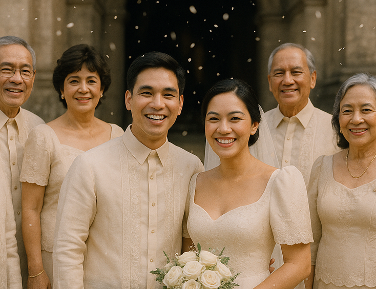
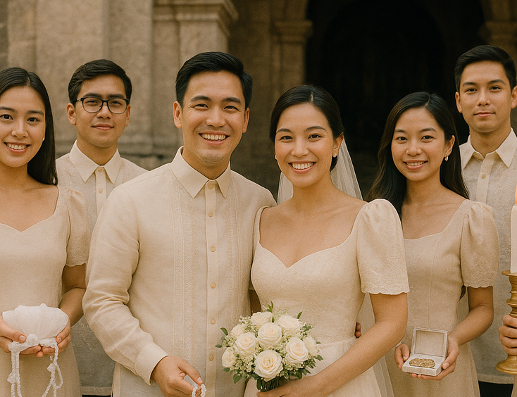
First (Paper) — Soft white, cream, and pale ivory. The Filipino climate makes pure white photograph as harsh in bright sunlight. Cream and soft ivory hold the meaning of paper while photographing more flatteringly across Filipino skin tones and tropical light conditions.
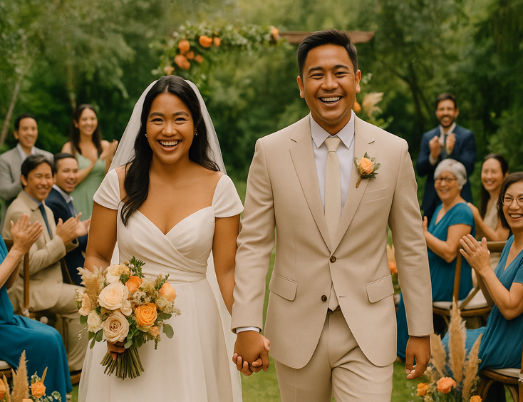
Fifth (Wood) — Warm tan, soft caramel, and natural beige. Wood symbolism in Filipino aesthetics pulls toward narra, mahogany, and acacia warmth rather than the cooler oak tones of the Western chart. Warm tan and caramel palettes photograph beautifully in heritage venues and outdoor garden celebrations.
Tenth (Tin or Aluminum) — Soft silver, dove gray, and muted pearl. The Filipino version softens the industrial coolness of the original tin symbolism. Dove gray reads as refined rather than cold, and pairs well with the warm undertones that flatter most Filipino skin tones.
Fifteenth (Crystal) — Clear glass, soft champagne, and frosted ivory. Crystal in the Filipino context leans toward champagne and soft pearl, which reflect the warm tropical light better than pure crystalline white. The palette suits intimate celebrations and quiet milestone markers.
Twentieth (China) — Soft porcelain blue, ivory, and gold accents. The Filipino version pulls from the porcelain tradition of imported Chinese ceramics that filled Filipino ancestral homes. The blue-and-ivory palette references heritage without veering into nautical.
Twenty-fifth (Silver) — Soft silver, ivory, and pearl gray. The silver jubilee palette has the most established Filipino aesthetic. Pure silver reads cold in tropical light, so most Filipino celebrations layer silver with pearl, soft gray, and ivory for warmth. The silver jubilee blessing tradition often anchors the color choices for the entire celebration.
Thirtieth (Pearl) — Soft pearl, blush, and champagne. Pearl in Filipino jewelry tradition pulls toward the warm, slightly cream-toned pearls of Philippine pearl farms rather than the cooler white pearls of Western tradition. The palette suits couples who want elegance without the formality of silver or gold.
Fortieth (Ruby) — Deep ruby, burgundy, and rose gold accents. Ruby is the most saturated color in the anniversary chart, and the one most likely to photograph badly if executed wrong. The Filipino version moderates pure ruby with rose gold accents and ivory complements, which keeps the color rich without making it overwhelming.
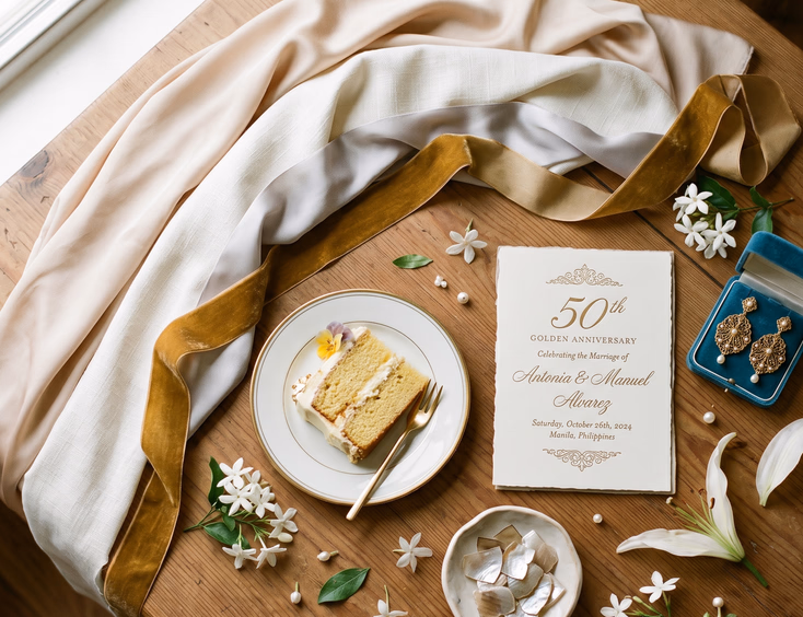
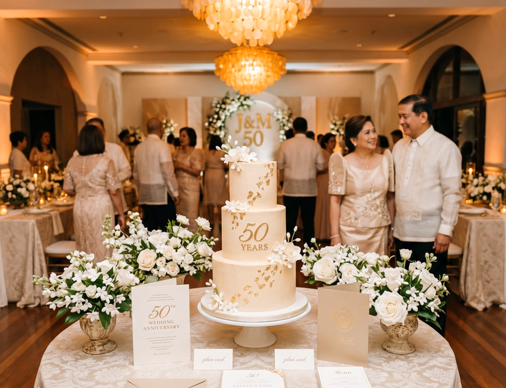
Fiftieth (Golden) — Deep gold, champagne, and ivory. The golden jubilee palette dominates Filipino anniversary aesthetics for good reason. The combination of warm gold with soft ivory and champagne photographs spectacularly in any light condition and suits both heritage venues and contemporary settings.
Sixtieth (Diamond) — Soft white, platinum, and clear crystal. The diamond anniversary palette is the most refined and the hardest to execute. Pure white-on-white works only in controlled venues with strong styling. Most Filipino diamond celebrations soften the palette with subtle platinum and ivory accents.
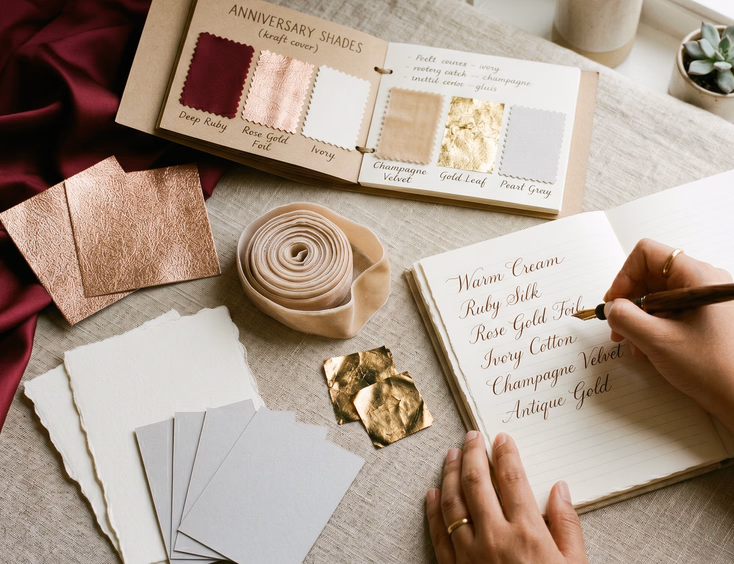
Choosing the Right Shade Within Each Symbolic Color
The chart names a color. The actual shade matters more than the name.
For silver years. Avoid metallic silver in invitation and stationery printing. The reflective surface photographs poorly and looks cheap in print. Choose soft silver gray as the base color, with metallic silver foil accents on specific design elements only. The stationery designers working in the heritage-modern space understand how to balance metallic accents against base colors.
For golden years. Pure gold reads brassy in most settings. Choose champagne gold or antique gold for fabrics and printing. Reserve true metallic gold for jewelry, accent details, and cake gilding. The heritage anniversary cake designs often pair true gold leaf with champagne buttercream for this exact reason.
For ruby years. Avoid fire-engine red, holiday red, or anything that reads festive rather than refined. Choose deep ruby, oxblood, or burgundy. The shade should look closer to a glass of vintage wine than to a Valentine's Day decoration.
For pearl years. Avoid stark white pearl in fabrics and styling. The Filipino pearl palette pulls toward warm cream pearl, with subtle pink or champagne undertones. The palette should look like a strand of South Sea pearls held in afternoon light, not like wedding-dress white.
For diamond years. White and platinum benefit from undertone differentiation. Pure white in the gown should pair with platinum (slightly cooler) or warm ivory (slightly warmer) in the venue styling rather than matching white-on-white across everything.
Color Coordination Across Anniversary Elements
The palette extends across every visual element of the celebration. Cohesion matters more than complexity.
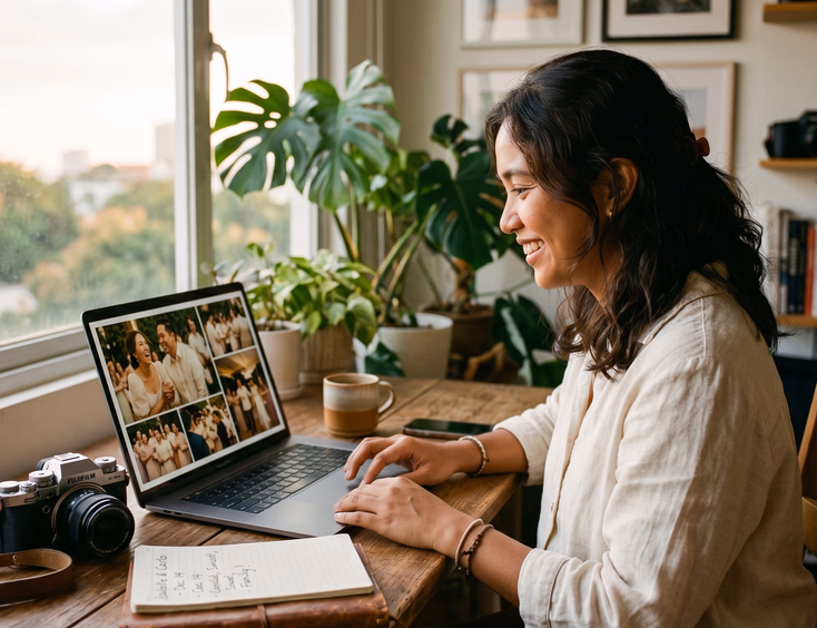
The invitation sets the master palette. The anniversary invitation designer chooses the base color, the accent colors, and the metallic finishes that define the celebration's visual identity. Every other element flows from the invitation.
The cake mirrors the invitation. The anniversary cake design should reference the invitation's palette directly. Champagne buttercream that matches the invitation's champagne accent. Hand-painted detail in the same blush as the RSVP card. The cake becomes a three-dimensional version of the invitation's design language.
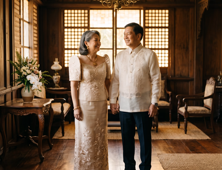
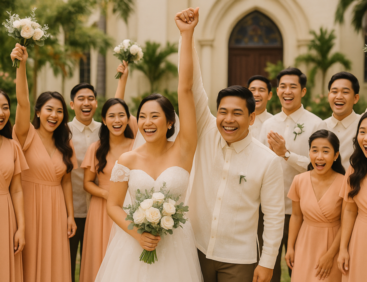
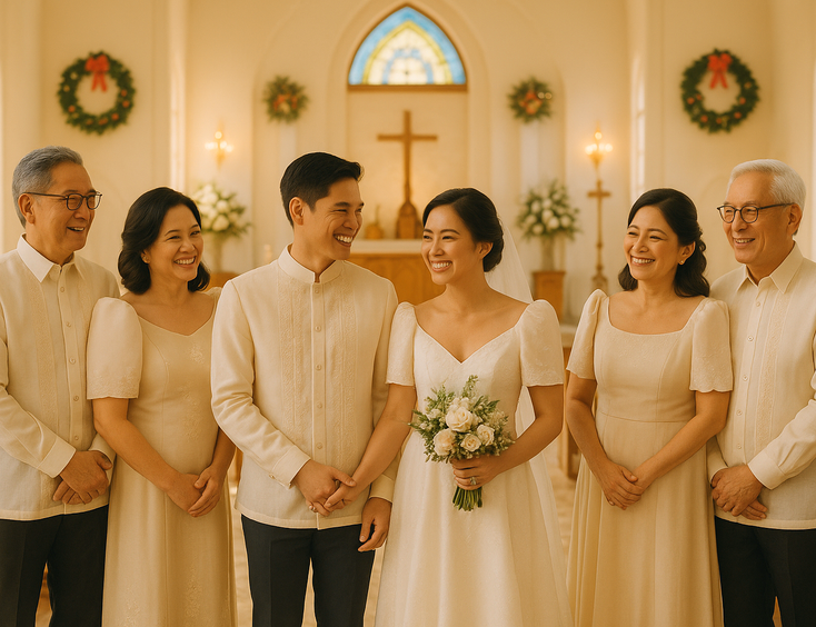
The couple's outfits pull from the palette. The coordinated his-and-hers styling anchors the palette in the visual center of every photo. The wife's gown and the husband's barong should both pull from the master palette, with one piece slightly darker for visual contrast.
The family follows the palette without matching the couple. Adult children and immediate family should dress in colors that harmonize with the master palette but don't replicate the couple's exact tones. Three steps softer or one step deeper than the couple's pieces creates visual harmony without competition.
The venue florals reinforce the palette. White sampaguita, ivory roses, soft stargazer lilies, and palette-matching dried elements like pampas grass create floral arrangements that frame the celebration without overwhelming it.
The lighting honors the palette. Warm candlelight flatters every Filipino anniversary palette. Cool LED lighting destroys warm palettes by stripping out the gold and amber tones. Most milestone celebrations benefit from warm ambient lighting combined with focused warm-toned spotlights on the couple and the cake.
How to Choose a Palette That Photographs Well at 80
Twenty years from now you'll look at the photos and notice the palette before you notice anything else.
Trust warm undertones for Filipino skin. Most Filipino skin tones photograph more flatteringly with warm-undertone palettes (cream, champagne, blush, ivory, soft gold) than with cool-undertone palettes (icy white, blue-silver, cool gray). Even silver and platinum jubilee palettes should incorporate warm anchor tones to prevent the cool palette from making skin tones look gray.
Avoid trend-dependent colors. The "millennial pink" of 2018 already looks dated. The "Pantone color of the year" rarely ages well. Stick to palettes that have looked refined for the past 100 years and will continue looking refined for the next 100. The traditional anniversary palette has held its appeal since the early twentieth century for reasons that haven't changed.
Test the palette in mixed lighting. The colors that look perfect in the venue's morning light may look different under the evening reception lighting. The photographers and styling team should verify the palette under both natural and artificial lighting conditions before the event.
Pair the palette with heritage references. Anniversary palettes that incorporate references to Filipino heritage aesthetics (capiz cream, sampaguita white, narra warmth, abaca natural) age better than palettes pulled from current Western trends. The heritage colors carry timeless cultural weight.
How Color Symbolism Connects to the Larger Anniversary Tradition
The color palette runs through every element of the celebration.
For couples doing intimate anniversaries, the palette shapes the quiet dinner venue selection, the staycation styling, and the small details that make the celebration feel intentional. Even a two-person anniversary dinner benefits from a clear palette decision around the table styling, the gift wrapping, and the small floral arrangements.
For couples doing milestone jubilee celebrations, the palette coordinates with the heritage town anniversary trip, the staycation venue selection, and the formal reception styling.
For couples building heritage-anchored anniversaries, the palette extends to the heirloom jewelry presented during the celebration, with gold tones for golden anniversaries, silver tones for silver jubilees, and pearl tones for pearl anniversaries.
The Filipino couple's guide to celebrating wedding anniversaries walks through how color symbolism fits alongside the Mass, the gifts, the venue, and the rest of the celebration.
For couples weighing styling decisions against the larger anniversary budget, the realistic cost breakdown across every scale of Filipino anniversary celebration shows where palette-driven elements like florals, custom stationery, and coordinated styling sit in the overall budget.
The Palette That Becomes the Memory
Twenty years from now you won't remember the appetizers.
You'll remember the soft champagne of your invitation suite, the hand-painted ivory detail on your golden anniversary cake, the antique gold tamburin necklace your husband clasped around your neck during dinner. The colors will hold the memory in a way the individual elements can't.
Pick the palette early. Let it shape every other decision. Trust the colors to do the heavy lifting.
Still Searching for a Right Match?
Find Your Perfect Wedding Supplier Today!
Discover trusted wedding suppliers across the Philippines in our complete directory. Compare services and connect with the ones that fit your dream celebration.
Browse Wedding SuppliersFeatured Blog Posts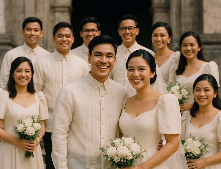

Filipino Wedding Entourage - Roles, Order of March, and Modern Etiquette
6 mins readCivil Weddings in the Philippines - Requirements, Costs, and Step-by-Step Process
9 mins readCivil Wedding Requirements in the Philippines - Complete Checklist
6 mins readCost of Wedding in the Philippines - 5 Essential Things You Need to Know
7 mins readPrincipal Sponsors (Ninong/Ninang) - How Many, How to Ask, What They Really Do
4 mins readVeil, Cord, Candle & Coins - Roles, Options, and When They Happen
4 mins readEntourage for a Traditional Pinoy Wedding - Complete Roles and Guide
6 mins readComplete List of Civil Wedding Requirements in the Philippines
8 mins readHow to Choose Wedding Ninongs and Ninangs - Ask Yourself These 3 Important Questions
5 mins read