Floral, Elegant, Rustic: A Guide to Filipino Wedding Invitation Aesthetics by Theme
Your wedding invitation has to match the wedding. A garden ceremony in Tagaytay and a ballroom reception at a five-star Manila hotel call for different visual languages, and guests pick up on the disconnect when a mismatched invitation arrives. The aesthetic you choose sets expectations before your guests ever step into the venue.
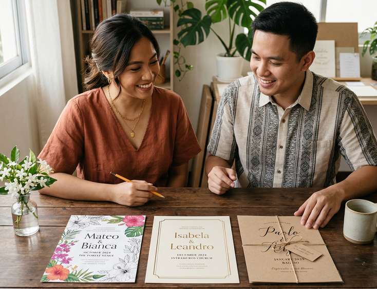
Filipino couples planning their invitations typically land on one of three visual directions: floral, elegant, or rustic. Each works. Each also has a version that looks intentional and a version that looks like a default. The difference lies in the specific choices made within the aesthetic rather than the aesthetic itself.
Floral
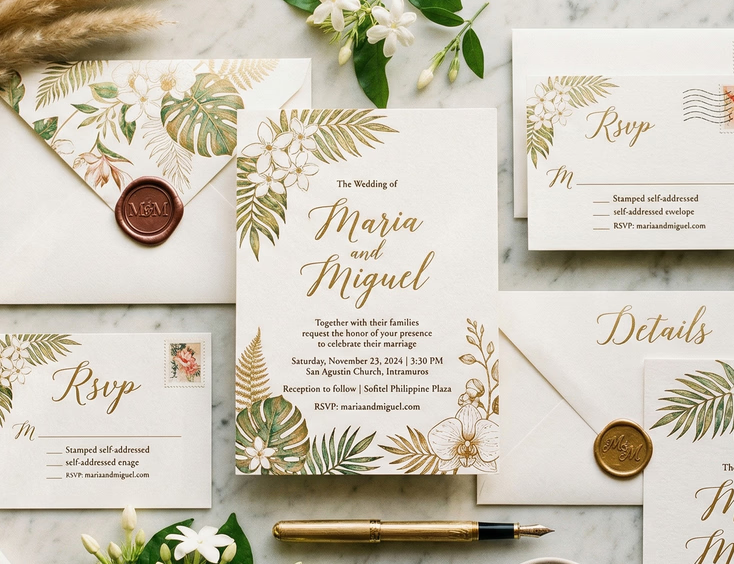
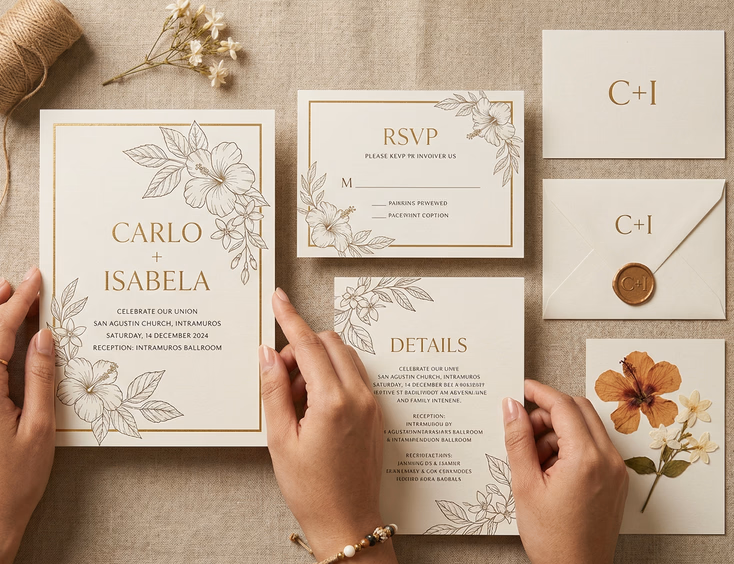
Floral wedding invitations are the most common choice among Filipino couples, and that popularity creates a problem. A generic floral invitation blends into every other one guests have received that year. The floral invitations that stand out make a clear decision about which flowers, which style of illustration, and which role the florals actually play in the layout.
Botanical line art is the current strong direction in Filipino floral design. Instead of watercolor blooms filling the card, designers draw precise botanical illustrations in single ink colors, usually black, deep green, or a muted terracotta. The result is formal enough for church weddings and fresh enough for outdoor ceremonies.
Watercolor florals still work when the palette is specific. Couples who go this route with generic pink-and-white watercolor end up with an invitation that looks identical to every bridal fair display from five years ago. A watercolor floral invitation anchored in an unusual color, deep burgundy and sage, or dusty blue and warm ochre, reads as a considered choice rather than a default.
Philippine-native florals give floral invitations genuine local character. Sampaguita, waling-waling orchids, ilang-ilang, and fire tree blooms carry visual identities that imported rose-and-peony arrangements do not. A designer who illustrates these accurately produces something that could only belong to a Filipino wedding.
The layout decision matters as much as the floral choice. Florals as a frame around centered text read as traditional. Florals bleeding across one corner of an asymmetric layout read as contemporary. Florals as a background pattern behind the full card read as maximalist. All three can work within the same aesthetic, but mixing them within a single suite creates visual confusion.
Floral invitations suit garden receptions, outdoor ceremonies, chapel weddings with natural decor, and any wedding where the styling includes actual flowers as a major design element. If your reception tables carry heavy floral centerpieces, your invitation can establish that language from the start.
Elegant
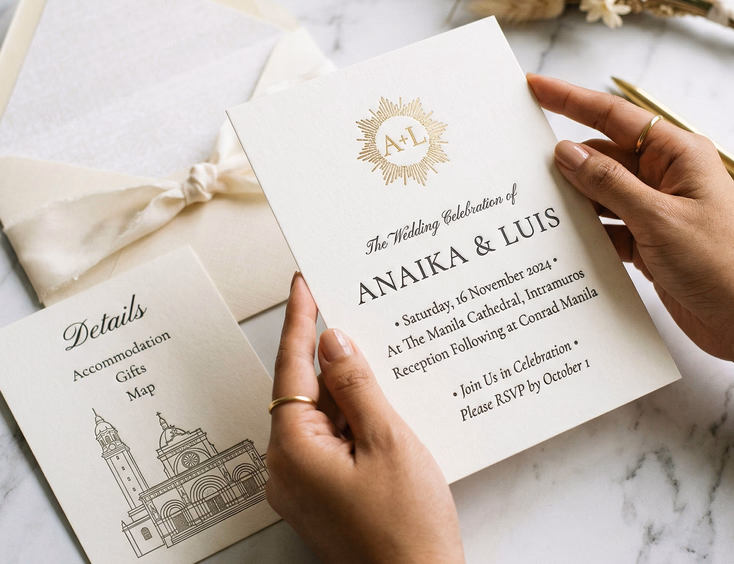
Elegant Filipino wedding invitations rely on restraint. The fewest possible design elements, the highest possible material quality, and typography that earns its place on the page.
The couples who get elegant invitations right choose one or two design decisions and execute them with care. A cream card with deep engraving, a single crest, and no other decoration. A white card with a single line of gold foil across the top, formal serif typography, and nothing else. These invitations communicate budget and taste without requiring any explanation.
Letterpress and foil stamping are the two printing techniques that carry the most weight in this category. Letterpress presses the type into the paper, creating a tactile impression guests feel when they run their thumb across the text. Gold and silver foil stamping catches light in a way that flat printing cannot replicate. Both cost significantly more than digital offset printing, and both read as premium immediately.
Typography carries elegant invitations in a way it does not carry floral ones. The typeface choice, the spacing between lines, the size relationship between the couple's names and the secondary text, these decisions make or break the design. A poorly spaced elegant invitation looks like a rough draft. A well-spaced one looks like a piece of fine stationery.
Monograms and crests appear frequently in Filipino elegant invitations, particularly among families with a tradition of formal entertaining. A well-designed monogram combining the couple's initials functions as a central design element that requires no floral or illustrative support. It also carries through naturally to wax seals, envelope liners, and napkin prints at the reception.
Elegant invitations suit formal evening receptions, cathedral weddings, hotel ballroom ceremonies, and weddings where the couple wants the invitation to feel like a keepsake rather than an announcement. They also suit couples whose guest list skews toward an older generation with formal expectations around correspondence.
One error Filipino couples make with elegant invitations is choosing the aesthetic and then adding elements that undercut it. A letterpress card with a sans-serif typeface loses formality. An engraved invitation with a brightly colored envelope liner becomes confused. Restraint means restraint across the entire suite, not just on the main card.
Rustic
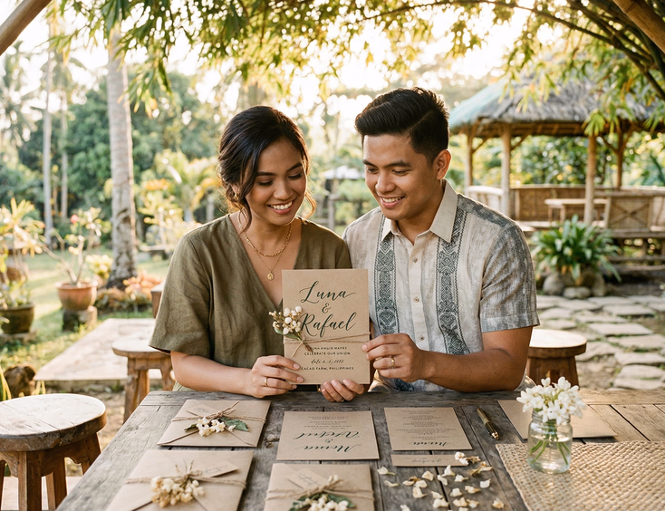
Rustic Filipino wedding invitations work when they feel warm and grounded rather than simply rough. The risk with this aesthetic is invitations that read as unfinished rather than intentional.
The rustic direction suits outdoor weddings, farm venues, beach ceremonies, and destination weddings in provincial settings. Filipino couples planning weddings in Batangas, Cebu, Bohol, Palawan, or any outdoor venue with natural landscaping tend toward this aesthetic for good reason. The invitation arrives before the venue and prepares guests for the experience.
Kraft paper is the base material most associated with rustic Filipino invitations. Natural brown kraft has warmth and texture that white card stock does not. It prints well in dark inks and takes letterpress clearly. An invitation printed in forest green or deep burgundy on kraft paper with twine binding reads as deliberate rather than cheap when the design is tight.
Twine, dried botanicals, and pressed flowers as suite elements add the tactile quality that makes rustic invitations feel premium. A kraft envelope sealed with beeswax and pressed with a floral stamp, enclosing an invitation with a dried sampaguita tucked alongside the card, gives guests something they are unlikely to throw away. These elements add cost but also add distinctiveness.
Handwritten and brush script typography suits the rustic aesthetic in a way that formal engraved serifs do not. A designer with genuine calligraphy skill produces something worth the cost. A computer-generated brush script that mimics handwriting undermines the warmth the aesthetic depends on. If your designer cannot show you actual calligraphy work, you are paying for a font rather than a skill.
Filipino heritage materials work well within rustic invitations. Abaca paper, banig-inspired borders, and natural fiber bindings carry a local agricultural character that connects to the broader aesthetic. A rustic invitation using indigenous Filipino materials reads as more specific than one using generic kraft and twine that could belong to a wedding anywhere in the world.
Imperfect edges appear in many rustic Filipino invitations as torn or deckled paper edges rather than clean cuts. This works when the rest of the design is controlled. An invitation with deckled edges, intentional white space, and clean typography reads as textured and warm. One with deckled edges, overcrowded text, and three different type styles reads as disorganized.
Mixing Aesthetics
Some Filipino couples want an invitation that sits between these categories, and that is a workable direction when the combination is deliberate. Rustic materials with elegant typography. Floral illustrations in a restrained elegant layout. These hybrids succeed when one aesthetic provides the structure and the other adds texture.
The combinations that fail usually try to balance all three. Floral illustrations on kraft paper with gold foil stamping and a monogram produces an invitation that cannot decide what it is. Picking one direction as the primary and one as a secondary, then stopping, produces something coherent.
Matching the Invitation to the Venue
Your invitation and your venue should read as belonging to the same event. Guests form expectations from the moment they open the envelope, and those expectations stay with them through the reception. An elegant engraved invitation followed by an outdoor provincial wedding disorients guests in a way that feels like miscommunication. A kraft and twine rustic invitation followed by a five-star hotel ballroom reception sends a similar mixed signal.
The couples who get this right treat the invitation as the first element of the wedding's visual identity rather than as a separate design task. The color palette, the material choices, and the typographic style should connect visibly to the reception florals, the table settings, and the signage at the venue.
Filipino wedding invitation design trends covers what designers across the Philippines are producing right now within each of these aesthetics, including which directions are gaining ground and which are becoming oversaturated. If you want to position your invitation as current rather than familiar, that context helps.
For couples weighing a heritage-specific design direction alongside floral, elegant, or rustic, how to design a wedding invitation that reflects Filipino heritage and culture covers how regional motifs, indigenous materials, and textile traditions can anchor any of these three aesthetics with specificity.
Finding a Designer Who Understands Your Aesthetic
An invitation designer who specializes in one aesthetic produces better results than a generalist who offers all three with equal confidence. Ask any designer you consult to show you ten examples within the specific aesthetic you are considering. The quality and consistency of those ten pieces tells you more than any price list or package description.
Ask about their printing relationships. Floral invitations with botanical line art require a printer who handles fine detail. Elegant invitations with foil stamping or letterpress require a printer with that specific equipment. A designer who cannot name their printing partners for those techniques probably outsources to a vendor they have limited control over.
Stationery and invitation suppliers in the Philippines who list design specializations by aesthetic make this comparison easier. Filtering by aesthetic before reaching out saves several consultations and steers you toward designers whose portfolios match your vision before any conversation starts.
The full context for all invitation decisions, from wording and timing to printing and etiquette, sits in the complete guide to Filipino wedding invitations. If you are still in early planning stages, that resource covers the decisions that come before and after the aesthetic choice, and it connects every part of the invitation process from a single place.
Your invitation tells guests what kind of wedding they are walking into. The aesthetic you choose for it is the first promise you make about the experience. Choose it with the same care you give the venue, the florals, and everything else guests will see on the day itself.
Still Searching for a Right Match?
Find Your Perfect Wedding Supplier Today!
Discover trusted wedding suppliers across the Philippines in our complete directory. Compare services and connect with the ones that fit your dream celebration.
Browse Wedding SuppliersFeatured Posts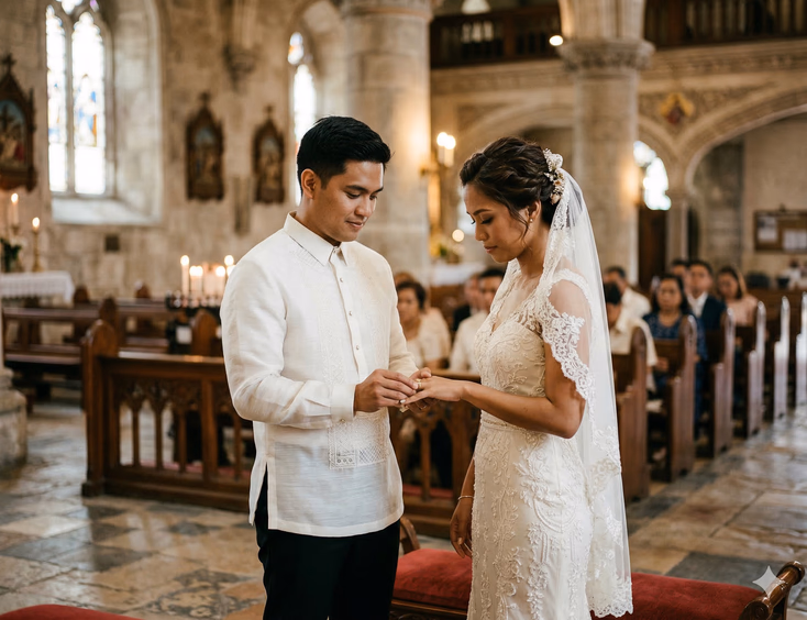


The Complete Filipino Couple's Guide to Wedding Rings & Bands in the Philippines: Traditions, Styles, Budgets & Where to Buy
22 mins readWedding Reception Ideas that Honor Tradition and Wow Your Guests
4 mins readFilipino Wedding Dress Guide for Style Traditions and Smart Shopping
6 mins readFilipino Wedding Cost Guide - Realistic Budgets, Percentages, and Price Drivers by Region
9 mins readPhilippines Honeymoon Guide - Best Islands, Resorts, Costs & 7–14 Day Itineraries
9 mins readFilipino Wedding Games - Traditions, Modern Twists, and Crowd-Pleasers for Every Reception
8 mins read