
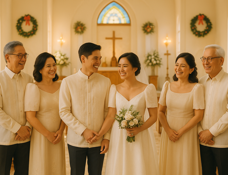
Color Palette Guide for Vow Renewal Ceremonies by Anniversary Year
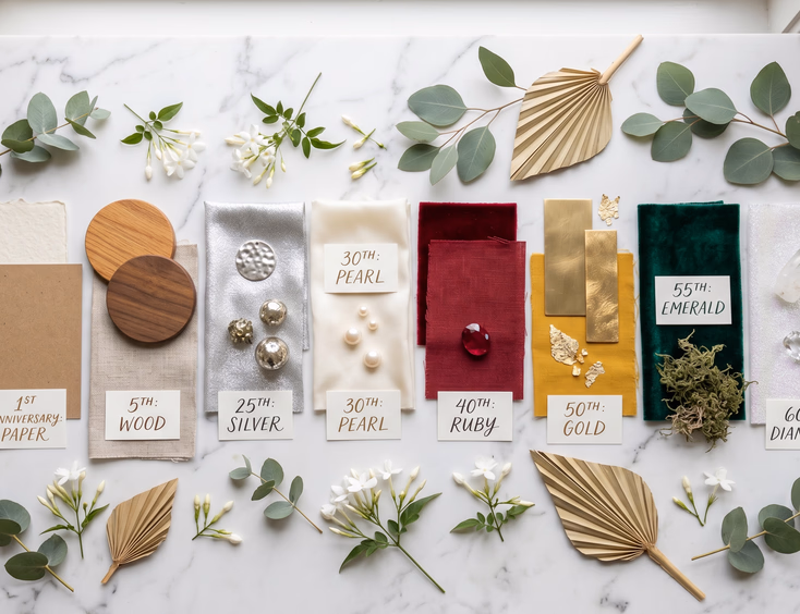
Anniversary years carry colors the way songs carry memories. Pearl whispers cream. Silver hums grey-white. Gold glows amber. Coral burns warm. Each year has a palette already attached to it, and the right palette gives your vow renewal a quiet through-line that ties every styling decision together.
This guide walks through the color palettes for each major anniversary year, how to translate the symbolism into actual swatches your vendors can work with, and which palettes survive contact with Filipino venues and weather.
Why Anniversary Color Palettes Matter
Anniversary symbols (tin, silver, pearl, gold) come with traditional colors. Some couples follow them strictly. Others use them as a starting point and adjust to fit their venue, season, or aesthetic.
Either approach works. What doesn't work is treating the anniversary year as decorative trivia and picking colors at random.
A palette tied to the anniversary year does three things. It anchors the styling in something meaningful rather than arbitrary. It gives vendors a clear brief instead of vague mood references. It signals the milestone to guests without needing oversized banners.
For broader theme decisions before locking in the palette, see our guide on romantic vow renewal theme ideas for Filipino couples.
How to Use This Guide
Each anniversary year below includes the traditional symbol, the core color palette, suggested accent colors, and notes on what works in Filipino venues.
Send the palette directly to your florist, stylist, caterer, and coordinator. Print the swatches if you can. Vendors deliver better work with specific colors than with descriptions like "soft and romantic."
For execution help, our guide on florists and stylists for an intimate vow renewal covers how to brief these vendors well.
1st Anniversary: Paper
Symbol. Paper.
Core palette. Cream, soft white, kraft brown, dusty rose.
Accent colors. Eucalyptus green, blush, gold.
Florals. Garden roses, peonies, eucalyptus, baby's breath, ranunculus.
Notes. Paper anniversary palettes lean understated. The first year doesn't usually call for a grand vow renewal, but couples who do mark it tend to favor an intimate, soft-toned ceremony. Cream and kraft brown photograph beautifully in natural light.
5th Anniversary: Wood
Symbol. Wood.
Core palette. Warm brown, terracotta, cream, sage green.
Accent colors. Burnt orange, mustard, deep amber.
Florals. Dahlias, garden roses, eucalyptus, dried palm fronds, dried pampas grass.
Notes. Wood anniversaries fit garden and ancestral home renewals beautifully. The earthy palette grounds the day in natural materials. Style with bare wooden tables, linen runners, and brass accents.
10th Anniversary: Tin
Symbol. Tin.
Core palette. Industrial grey, soft white, deep charcoal, brushed silver.
Accent colors. Black, warm white, single accent color like deep red or forest green.
Florals. White roses, white anthuriums, dusty miller, white hydrangeas, dark leafy foliage.
Notes. Tin pulls toward modern, slightly moody aesthetics. Industrial textures, brushed metal accents, candle-heavy lighting. The palette works in contemporary venues and modern restaurants. Avoid in heavily floral garden settings where the moody palette fights the lush greens.
For tin-specific planning, see our guide on tin anniversary vow renewals.
15th Anniversary: Crystal
Symbol. Crystal.
Core palette. Clear, white, soft icy blue, silver.
Accent colors. Pale lavender, soft pink, faceted glass accents.
Florals. White peonies, white roses, hydrangeas, baby's breath.
Notes. Crystal palettes lean luminous and clean. Mercury glass votives, clear chargers, crystal stemware, and faceted candle holders multiply the light. Works best for hotel and ballroom renewals where the palette can shine.
20th Anniversary: China
Symbol. China.
Core palette. White, soft blue, navy, gold.
Accent colors. Powder pink, ivory, antique gold.
Florals. White roses, blue hydrangeas, anemones, eucalyptus.
Notes. China palettes work beautifully with patterned dinnerware, vintage china pieces sourced from antique shops, and Filipino heritage homes. The blue-and-white pairs with traditional Filipino aesthetics surprisingly well.
25th Anniversary: Silver
Symbol. Silver.
Core palette. Soft white, mercury silver, brushed grey, cream.
Accent colors. Pale blush, pearl, soft gold for warmth.
Florals. White roses, white peonies, white anthuriums, eucalyptus, dusty miller, silver brunia.
Notes. Silver reads cooler and more refined than gold. Avoid polished silver in favor of mercury glass and brushed finishes. Pair with soft candlelight to keep the palette warm rather than cold.
For silver-specific styling, our guide on how to plan a silver wedding anniversary vow renewal and our silver and gold themed vow renewal decor guide cover execution in detail.
30th Anniversary: Pearl
Symbol. Pearl.
Core palette. Cream, ivory, soft white, oyster.
Accent colors. Pale blush, soft champagne, warm taupe.
Florals. White peonies, white garden roses, ivory ranunculus, eucalyptus, white anthuriums.
Notes. Pearl is the quietest of the milestone palettes. The whole room should feel washed in cream and ivory with subtle texture changes between linens, florals, and tableware. Photographs beautifully in soft natural light.
For pearl-specific planning, see our guide on pearl anniversary celebrations.
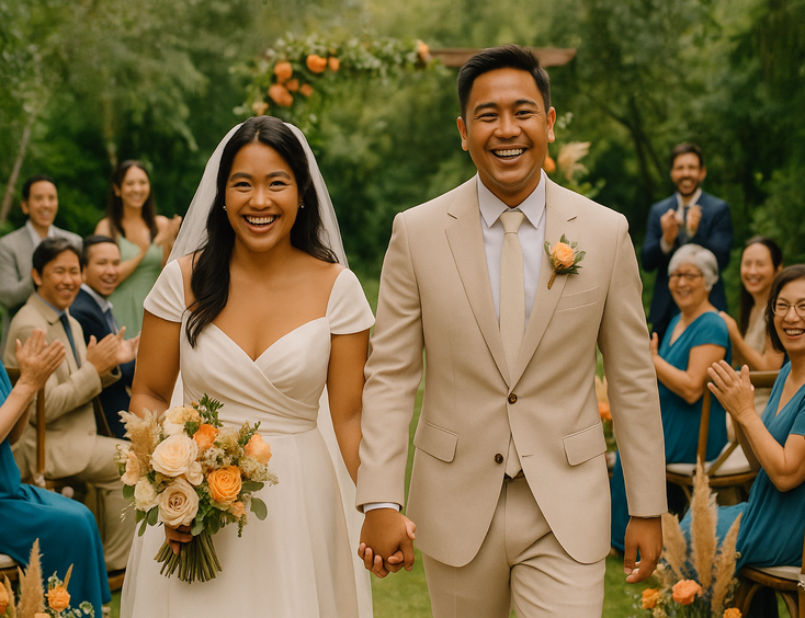
35th Anniversary: Coral
Symbol. Coral.
Core palette. Coral pink, warm peach, cream, soft terracotta.
Accent colors. Sage green, blush, warm amber.
Florals. Coral garden roses, peach dahlias, ranunculus, snapdragons, eucalyptus.
Notes. Coral works beautifully for beach and tropical garden renewals. The palette agrees with the natural setting. Avoid in cool-toned indoor venues where the warmth can read as orange under fluorescent lighting.
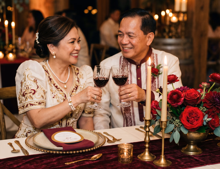
40th Anniversary: Ruby
Symbol. Ruby.
Core palette. Deep red, burgundy, cream, antique gold.
Accent colors. Wine, terracotta, warm bronze.
Florals. Red garden roses, burgundy dahlias, deep red ranunculus, eucalyptus, dried foliage.
Notes. Ruby is the boldest of the milestone palettes. Use sparingly to avoid overwhelming the space. Deep red linens with cream tablecloths underneath. Ruby florals as accents rather than the main palette. Works best in heritage venues and indoor settings where the depth of color can be controlled by lighting.
45th Anniversary: Sapphire
Symbol. Sapphire.
Core palette. Deep blue, navy, cream, soft silver.
Accent colors. Royal blue, soft white, antique silver.
Florals. White roses, white peonies, blue hydrangeas, deep blue delphinium, eucalyptus.
Notes. Sapphire palettes work best in formal indoor venues. The deep blue grounds the room. Pair with crystal glassware and silver accents. Avoid in tropical garden venues where the cool palette fights the warm setting.
50th Anniversary: Gold
Symbol. Gold.
Core palette. Antique gold, warm cream, ivory, soft amber.
Accent colors. Champagne, brass, burnished bronze.
Florals. Cream garden roses, peach dahlias, amber ranunculus, eucalyptus, dried palm fronds.
Notes. Gold is the most theatrical of the milestone palettes. Lean into candlelight, brass candlesticks, calligraphy stationery, and aged gold flatware. Works in nearly every venue type. Avoid bright polished gold in favor of antique brass and burnished finishes.
For golden anniversary planning, our guide on golden wedding anniversary vow renewal ideas covers the milestone in depth.
55th Anniversary: Emerald
Symbol. Emerald.
Core palette. Deep green, cream, antique gold, soft white.
Accent colors. Forest green, sage, warm bronze.
Florals. White roses, deep green foliage, eucalyptus, ferns, monstera leaves.
Notes. Emerald palettes pair beautifully with garden venues. The green of the palette agrees with the natural setting. Use deep green linens or glassware as accents rather than dominant colors. Works particularly well for heritage Filipino renewals with hand-loomed textile accents.
60th Anniversary: Diamond
Symbol. Diamond.
Core palette. White, clear, silver, soft platinum.
Accent colors. Pale icy blue, soft pink, crystal accents.
Florals. White peonies, white roses, white orchids, anemones, eucalyptus.
Notes. Diamond is the most luminous of the milestone palettes. Stick to white and clear elements with sparse silver accents. The palette demands strong lighting design. Plan candle-heavy ceremonies or schedule for golden hour outdoor light.
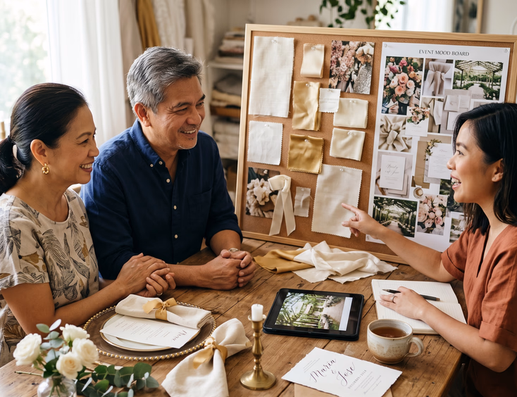
How to Translate a Palette Into Decisions
Once you've picked the palette, apply it across five decisions.
Florals. Send the palette to your florist with specific flower preferences. Avoid bright greens and bold accent flowers that fight the core palette.
Linens and tableware. Match your tablecloths, runners, napkins, and chargers to the palette. Even a small mismatch (a too-bright white napkin against a cream tablecloth) reads in photos.
Stationery. Invitations, menu cards, place cards, and signage all carry the palette. Hand-calligraphed pieces in the palette ink (gold, silver, deep red, navy) elevate the day.
Attire. Brief your guests on the palette through the dress code. Send specific colors, not vague directions. Our guide on vow renewal attire for guests covers how to communicate this.
Cake and dessert table. The cake should sit comfortably in the palette. Pearl anniversary cakes in cream and white. Gold anniversary cakes with antique gold detailing. Avoid bright colored fondant that fights the room. For cake and dessert direction, our guide on catering, cake, and salu-salo ideas covers options.
What to Avoid Across All Palettes
Three mistakes flatten any palette no matter how carefully you choose it.
Adding too many accent colors. A palette of three to five colors works. Six or more turns chaotic. Pick your core palette and one or two accents. Discipline.
Bright fluorescent venue lighting. Cold white overhead lighting kills warm palettes (cream, gold, coral, amber) and overcorrects cool palettes (silver, crystal, sapphire) into clinical territory. Confirm dimming options with your venue.
Plastic decor. Plastic chargers, plastic florals, plastic cake stands. Plastic reads false in every palette. Spend the extra on real materials.
Mixing Palettes Across Multiple Anniversaries
Some couples celebrate at off-years (12th, 17th, 28th) that don't have strong color associations. Two approaches work.
The first approach: borrow from the nearest milestone year. A 28th anniversary borrows from the 30th (pearl). A 17th anniversary borrows from the 15th (crystal) or 20th (china).
The second approach: choose a palette based on the venue and season instead of the anniversary year. A summer beach renewal can use a coral or sand palette regardless of the year. A December garden renewal can use cream and sage regardless of which anniversary it marks.
Either approach beats forcing a palette that doesn't fit the day.
For full ceremony planning across all anniversary milestones, our complete Filipino couple's guide to vow renewals walks through how palette fits the larger planning arc. For specific anniversary symbolism, our Filipino wedding anniversary names and symbols by year guide covers the full reference.
The right palette for your vow renewal won't shout at guests. It'll hold the day in a single coherent visual register that quietly signals the milestone you've reached. Pick the colors that fit your year, your venue, and the marriage you've actually built, and let the palette do its work.
Still Searching for a Right Match?
Find Your Perfect Wedding Supplier Today!
Discover trusted wedding suppliers across the Philippines in our complete directory. Compare services and connect with the ones that fit your dream celebration.
Browse Wedding SuppliersFeatured Blog Posts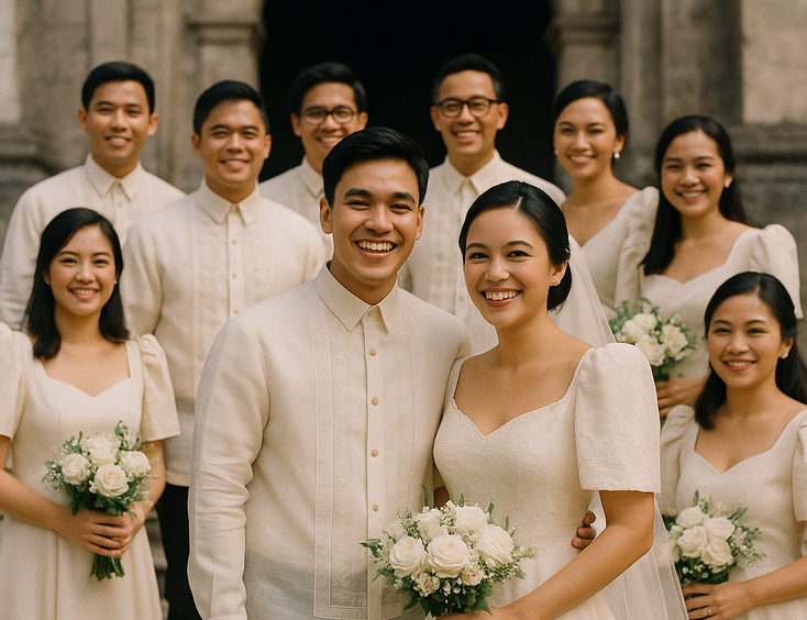

Filipino Wedding Entourage - Roles, Order of March, and Modern Etiquette
6 mins readCivil Weddings in the Philippines - Requirements, Costs, and Step-by-Step Process
9 mins readCivil Wedding Requirements in the Philippines - Complete Checklist
6 mins readCost of Wedding in the Philippines - 5 Essential Things You Need to Know
7 mins readPrincipal Sponsors (Ninong/Ninang) - How Many, How to Ask, What They Really Do
4 mins readVeil, Cord, Candle & Coins - Roles, Options, and When They Happen
4 mins readEntourage for a Traditional Pinoy Wedding - Complete Roles and Guide
6 mins readComplete List of Civil Wedding Requirements in the Philippines
8 mins readHow to Choose Wedding Ninongs and Ninangs - Ask Yourself These 3 Important Questions
5 mins read