How to Choose Your Debut Color Palette
Your color palette is the first design decision that touches everything else. Your gown, your invitations, your florals, your stage, your linens, your cake, your souvenirs. Pick the wrong palette and you spend the rest of planning fighting against it. Pick the right one and every other decision falls into place faster.
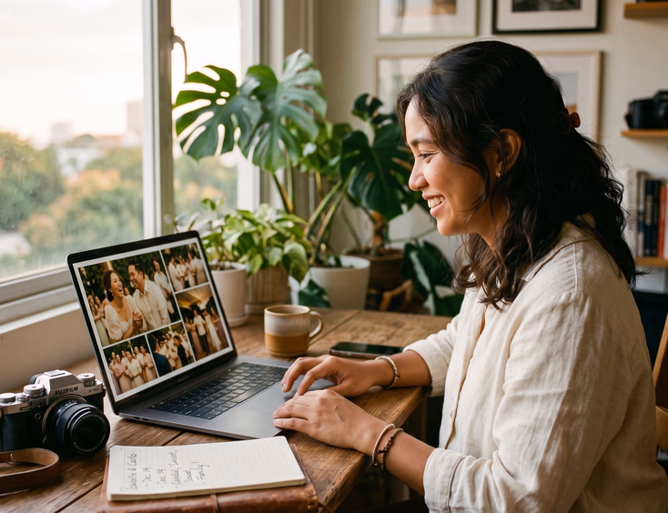
Most Filipino debutantes treat color choice as an afterthought. They pick "pink and gold" because their best friend did it, or "rose gold and white" because Pinterest told them to. The result is a debut that looks like every other debut. If you are still mapping out your overall planning approach, the complete Filipino debut guide gives you the broader framework before you commit to a palette.
Why Your Color Palette Matters More Than You Think
Color affects how guests feel when they walk in. It shapes how your photos read on camera. It determines whether your venue lighting flatters your gown or fights it. It decides if your stage looks intentional or chaotic.
A defined palette gives every supplier a reference point. Your florist, your stylist, your invitation designer, and your stationery vendor all need clear color direction. Without it, you get a coordinator chasing five different visions and a final setup where nothing matches.
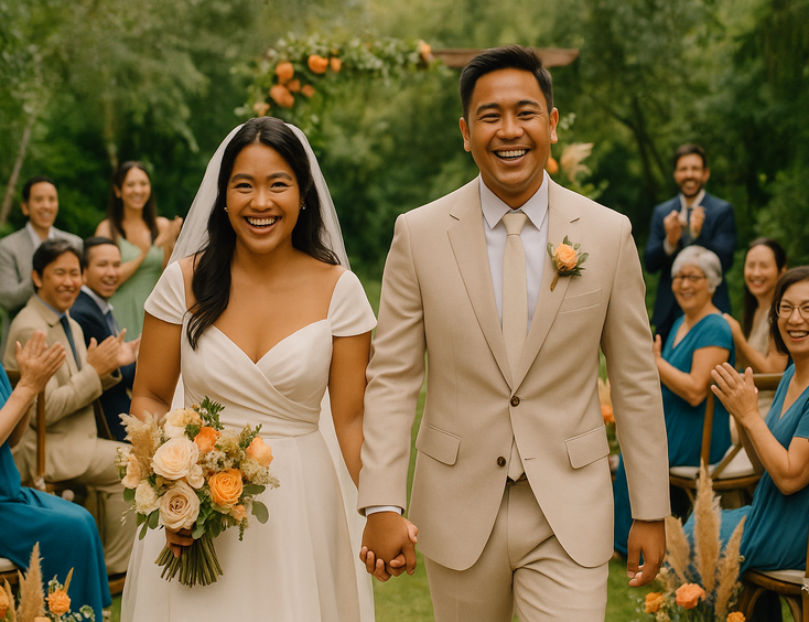
Your palette also signals your aesthetic before you say a word. Burgundy and gold reads dramatic and rich. Sage and cream reads soft and modern. Black and white reads editorial and refined. Each combination tells your guests what kind of debut they walked into.
The Three-Color Rule
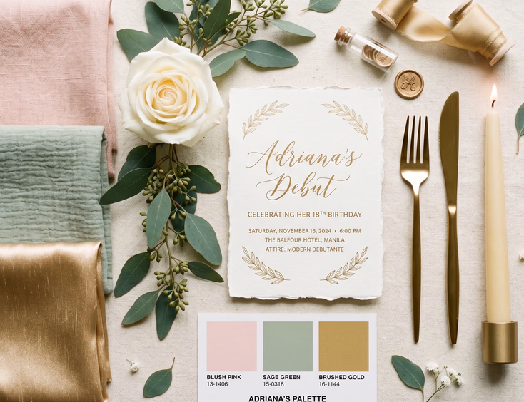
Build your palette with three colors. One dominant, one secondary, one accent. That ratio handles every design decision without overcrowding.
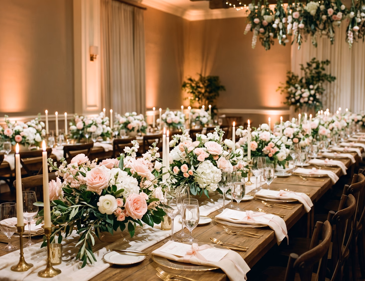
Your dominant color covers about 60 percent of your visual setup. Tablecloths, drapery, gown, primary florals, and major signage. This is the color guests remember.
Your secondary color covers about 30 percent. Bridesmaid attire, secondary florals, runner accents, and complementary stationery elements.
Your accent color covers about 10 percent. Candleholders, flatware, ribbon details, calligraphy, and small finishing touches.
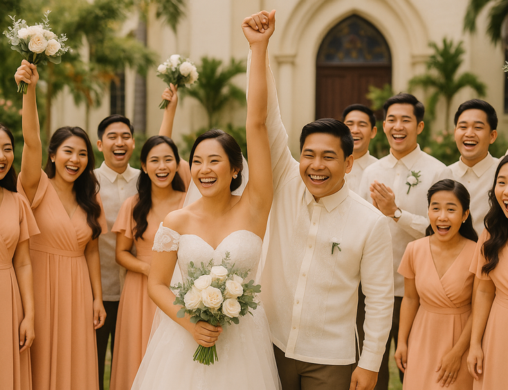
A palette of ivory, sage green, and gold means ivory dominates, sage adds depth, and gold finishes the look. A palette of blush, mauve, and silver means blush leads, mauve supports, and silver punctuates.
Adding a fourth or fifth color breaks the discipline. Restraint reads more expensive than abundance. If you want to see how this plays out in a fully restrained aesthetic, read minimalist debut theme elegant ideas for the understated debutante.
Starting From Your Theme
Your theme dictates your palette range before you start narrowing. A fairytale debut pulls from one set of colors. A garden debut pulls from another. A Korean-inspired debut pulls from a third.
For fairytale themes, look at jewel tones, soft pastels, or classic princess shades. Powder blue with silver, blush pink with gold, or champagne with ivory all carry the storybook read. To explore this direction further, see fairytale debut theme inspiration and styling tips.
For garden themes, lean into colors that complement nature. Sage green with blush and cream, dusty blue with gold and ivory, or lavender with silver and white. Avoid colors that clash with greenery, like neon brights or harsh reds. For more direction, see garden debut theme creating a romantic outdoor celebration.
For Korean-inspired themes, match the cultural direction. Hanbok aesthetics call for jewel tones with gold. K-drama romance calls for soft pastels. Modern Seoul minimalism calls for neutrals with one accent. Read Korean-inspired debut ideas for K-culture lovers for the full breakdown.
If you have not locked your theme yet, browse trending debut theme ideas for the modern Filipino debutante before choosing your palette.
Considering Your Skin Tone
Your gown lives in your palette. The color you wear shows up in every photo, every video, and every guest's memory. Choose a palette that flatters your skin tone first.
Filipino skin tones generally fall into warm, neutral, or cool categories. Warm undertones have yellow, peach, or golden hints. Cool undertones lean pink, red, or bluish. Neutral undertones balance both.
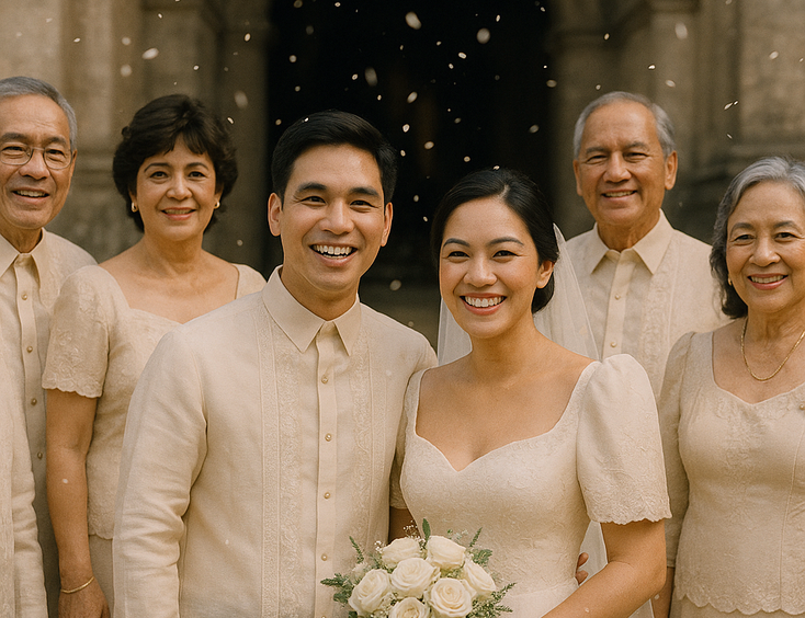
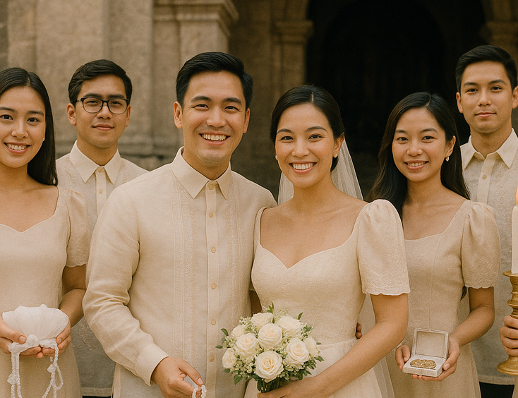
For warm skin tones, palettes built around gold, ivory, peach, blush, terracotta, sage green, olive, mustard, and warm browns photograph beautifully. Pure white and icy cool colors can wash you out.
For cool skin tones, palettes built around silver, white, cool blues, lavender, plum, emerald, dusty pink, and jewel tones flatter your complexion. Warm yellows and orange-based shades can muddy your skin.
For neutral skin tones, most palettes work, but the most flattering options sit in the middle. Champagne, taupe, mauve, dusty rose, and muted greens. Pure extremes on either end are less forgiving.
A makeup trial in your gown color confirms whether the choice works. Schedule this before finalizing your gown order. To dive deeper into beauty direction, read debut hair and makeup inspiration for every theme.
Venue Compatibility
Your venue carries its own color story. Walls, flooring, lighting fixtures, and architectural details all contribute to the visual environment. Your palette either complements those colors or clashes with them.
Before locking your palette, do a venue ocular and note:
- Wall colors and their undertones
- Carpet or flooring shades
- Existing curtains, drapery, or fixed decor
- Chandelier finishes and lighting fixture colors
- Stage backdrops and built-in installations
A hotel ballroom with warm beige walls and gold chandeliers fights a cool palette of icy blue and silver. The same room embraces ivory, sage, and gold beautifully.
A venue with stark white walls and modern architecture handles bold or moody palettes well. The same venue with a pastel palette can read flat and underdesigned.
A garden venue brings its own dominant green. Your palette needs to complement that, not compete. To explore how venues shape decisions, read how to choose the right debut venue a practical checklist.
Lighting Changes Everything
Color shifts dramatically under different lighting conditions. The blush pink that looks soft in daylight reads peachy under warm tungsten and washed-out under cool LED.
Three lighting scenarios to consider:
For daytime outdoor venues, natural sunlight handles most of your color rendering. Most palettes read true. Cool tones can feel washed out at noon and richer at golden hour.
For evening indoor venues, your lighting designer controls the color story. Warm white lighting around 2700K to 3000K enriches reds, oranges, pinks, and golds. It mutes blues, greens, and silvers. Cool white lighting around 4000K and above does the opposite.
For colored uplighting, the wall colors and your dominant palette shift based on the light. A blush pink palette under blue uplighting reads purple. A sage green palette under amber uplighting reads gold-green.
Ask your lighting supplier about color temperature and uplighting plans during your initial meeting. Pull reference photos that show your palette under the lighting style you want. Confirm pinspot lighting on centerpieces and focal points to keep your palette true in photos.
How Your Palette Affects Florals
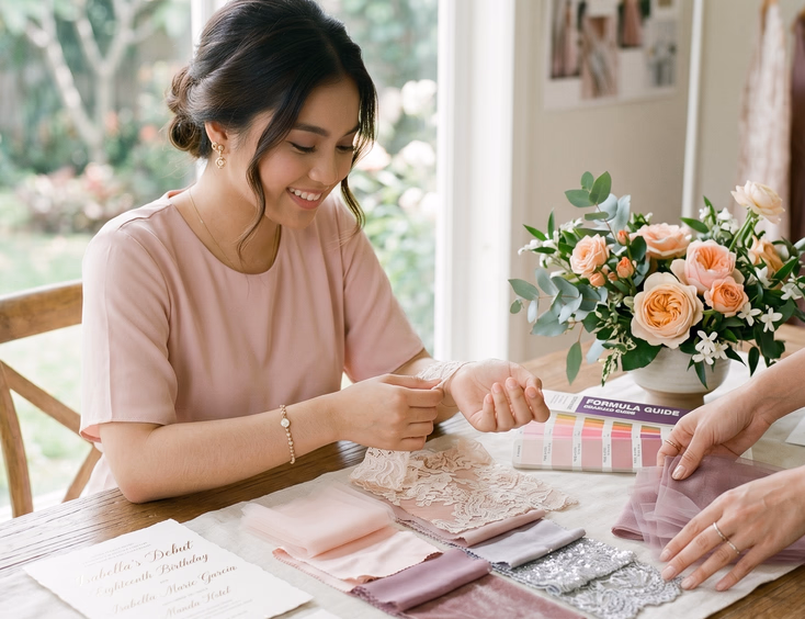
Your florist needs your palette before designing anything. Specific Pantone codes or color swatches help more than vague descriptions like "pinkish" or "earthy tones."
Different blooms come in different color ranges. Knowing what flowers exist in your palette shapes what you can ask for.
For blush and ivory palettes, garden roses, peonies, ranunculus, lisianthus, and hydrangeas all bloom in soft pinks and creams.
For sage and white palettes, eucalyptus, dusty miller, white roses, calla lilies, and chrysanthemums hold the color story without forcing dye jobs.
For burgundy and gold palettes, dark dahlias, deep red roses, anthuriums, and dried wheat carry the saturated tones.
For black and white palettes, white anthuriums, calla lilies, white roses, and dark foliage like black ti leaves or dark eucalyptus create the contrast.
Some palettes require dyed florals to achieve specific shades. Dyed roses, bleached eucalyptus, and tinted hydrangeas all exist but cost more than naturally available varieties. Discuss this trade-off with your florist before committing.
Imported flowers expand your palette options but add cost. Filipino-grown blooms work for most palettes if you stay within naturally available colors.
Stationery and Print Colors
Color reproduction on paper differs from screens. The shade that looks perfect on your digital mood board may print darker, lighter, or with different undertones.
Order printed samples before bulk ordering any invitations, menus, or signage. Test the exact paper stock, printing method, and ink colors. A digital print on matte cardstock looks different from a letterpress print on cotton paper, even with the same color file.
Pantone matching gives you the most consistency across vendors. Provide your stationery designer, signage maker, and printer with specific Pantone codes rather than describing colors. "Blush pink" means different things to different people. Pantone 12-1310 TCX is exact.
For wording and etiquette direction beyond color, read debut invitation wording samples and etiquette.
Photographing Your Palette
How your palette photographs matters as much as how it looks in person. Some color combinations that look stunning on the day photograph poorly.
Combinations that photograph beautifully:
- Soft neutrals with one rich accent color
- Monochromatic palettes in varying shades of the same hue
- High-contrast pairings like black and white or navy and ivory
- Warm earth tones grounded by cream or beige
- Jewel tones balanced with metallic accents
Combinations that photograph poorly:
- Pure white-on-white setups without warm tones to add depth
- Neon colors that read inaccurate under most camera settings
- Too many competing saturated colors fighting for attention
- Pastels paired with bright fluorescent accents
- Heavily mixed metallics that look chaotic in close-ups
Pull reference photos from real events shot by professional photographers rather than Pinterest mood boards. Real photography under venue lighting tells you the truth.
Brief your photographer on your palette during your initial meeting. Pull edited photos that match the color story you want. To explore working with your photo team, read how to choose the right debut photographer and videographer.
Seasonal Considerations
Your debut date affects which palettes feel right. Filipino debuts happen year-round, but the season shapes guest expectations.
For dry season debuts from November to May, lighter palettes work beautifully. Blush, ivory, sage, and cream all photograph well in cooler temperatures. Christmas-season debuts in December can lean into deep reds, emerald greens, and gold for a holiday feel.
For rainy season debuts from June to October, richer palettes hold up better in gray skies. Burgundy, navy, mustard, and forest green all carry depth that pastels can lose in overcast weather. Indoor venues become more important, which expands your palette options.
For school break months like April, May, and December, more guests can attend. Palettes that photograph well in large group shots matter more. Mid-tones and grounded neutrals carry better than pale palettes that get lost in wide shots.
Common Color Palette Mistakes
The debutantes who get their palette right avoid these traps:
- Choosing colors based on trends rather than personal style or skin tone
- Picking too many colors and ending up with a chaotic visual story
- Skipping the lighting conversation with venue and design suppliers
- Trusting Pinterest mood boards without confirming colors photograph as expected
- Locking in a palette before seeing the venue under event lighting
- Forgetting to give specific color codes to every supplier
- Following a friend's palette instead of building one that suits your celebration
Your palette should feel like yours, not borrowed. If you scroll through ten other Filipino debuts and find your exact palette in three of them, redesign. For wider planning pitfalls to watch out for, read common debut planning mistakes every debutante should avoid.
Testing Your Palette Before Locking In
Before finalizing every supplier order, run these tests:
- Lay swatches of every palette color next to each other in daylight and under warm indoor lighting
- Hold your gown swatch against your skin in both natural and indoor light
- Photograph the swatches together to see how they read on camera
- Place your invitation print sample next to your linen swatch and florals
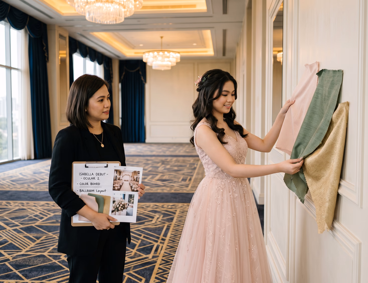
- Schedule a venue walkthrough with your stylist holding palette swatches against walls, drapery, and flooring
- Confirm with your makeup artist that your foundation and lip colors complement the palette
A formal mood board or styling board pulls these elements together visually. Your coordinator or stylist can build one for you. If you do not have a coordinator yet, essential debut suppliers you need to book early covers which vendors fill up fastest.
Budget Considerations for Color Choices
Your palette affects your budget in ways most debutantes underestimate. Some colors cost significantly more to execute well.
Higher-cost palettes:
- Specific shades that require dyed florals or imported blooms
- Bold or unusual colors that require custom-dyed linens
- Metallic finishes that require premium tableware rentals
- Saturated jewel tones that need professional lighting to render correctly
- Palettes with multiple metallic accents requiring matching across all vendors
Lower-cost palettes:
- Neutral tones using readily available linens and standard florals
- Single-metallic palettes that match standard rental inventories
- Classic combinations like ivory and green that work with stock supplies
- Monochromatic palettes that simplify supplier coordination
If your budget runs tight, choose a palette that aligns with widely available rentals and locally grown florals. To plan around your actual numbers, read how much a debut costs in the Philippines and how to plan a debut on a budget without compromising style.
Communicating Your Palette to Every Supplier
Once you lock your palette, every supplier needs the same reference. Build a one-page document with:
- Pantone codes for each palette color
- Hex codes for digital reference
- Physical swatches of fabric, ribbon, and paper in each color
- Reference photos of the exact aesthetic you want
- Examples of what to avoid
Share this document with your stylist, florist, invitation designer, signage maker, lighting team, cake baker, and coordinator. Bring physical swatches to every supplier meeting. Digital references shift across screens. Physical samples do not.
Update suppliers if you change your palette mid-planning. A switch from blush to mauve sounds small but cascades across every order. Avoid mid-planning changes if you can.
Building a Palette That Lasts
Your debut photos will follow you for decades. Trendy palettes age fast. Restrained, considered palettes age well.
Look at debut photos from ten years ago. The palettes that still look beautiful share characteristics: clear focus, intentional restraint, and respect for the debutante's coloring rather than trend-chasing.
Pick a palette that suits you, your venue, your theme, and your lighting plan. Avoid copying what trended last year. Build something that will still feel like you when you look back.
The right palette makes every other decision easier. The wrong one makes every decision harder. Choose carefully, test thoroughly, and commit.
Still Searching for a Right Match?
Find Your Perfect Wedding Supplier Today!
Discover trusted wedding suppliers across the Philippines in our complete directory. Compare services and connect with the ones that fit your dream celebration.
Browse Wedding SuppliersFeatured Blog Posts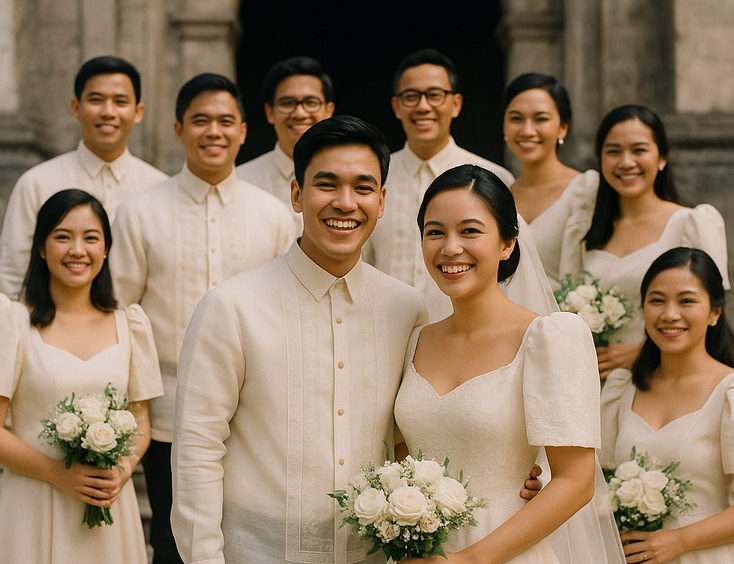

Filipino Wedding Entourage - Roles, Order of March, and Modern Etiquette
6 mins readCivil Weddings in the Philippines - Requirements, Costs, and Step-by-Step Process
9 mins readCivil Wedding Requirements in the Philippines - Complete Checklist
6 mins readCost of Wedding in the Philippines - 5 Essential Things You Need to Know
7 mins readPrincipal Sponsors (Ninong/Ninang) - How Many, How to Ask, What They Really Do
4 mins readVeil, Cord, Candle & Coins - Roles, Options, and When They Happen
4 mins readEntourage for a Traditional Pinoy Wedding - Complete Roles and Guide
6 mins readComplete List of Civil Wedding Requirements in the Philippines
8 mins readHow to Choose Wedding Ninongs and Ninangs - Ask Yourself These 3 Important Questions
5 mins read