Color Palettes and Motifs for Filipino Weddings
Color choices in the Philippines carry mood legacy and comfort. Sunlit beaches stone churches and humid gardens each treat hues differently. Build a palette that honors family and faith while staying cool in tropical light by pairing breathable textiles with thoughtfully chosen tones and motifs.
Start with light venue and season
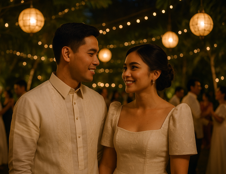
Golden hour by the sea warms peaches corals and shell tints while cool church interiors flatter ivory champagne and soft sage. In gardens lean into leaf greens and creamy whites for balance. Lock your direction with swatches and then sync florals stationery and attire so everything reads as one story.
Motifs with Filipino soul
Sampaguita inspired details pearl accents capiz shimmer and solihiya weave patterns translate beautifully into modern weddings. Keep scale refined on invites linens and accessories so motifs elevate rather than overwhelm. If you love palm textures a stylized anahaw shape pairs well with neutral fabrics and brushed gold.

Build from the gown outward
Native textiles like piña and jusi often sit in the ivory to champagne family which plays nicely with warm metallics and fresh greens. Let your gown guide the neutral base then layer one or two accent hues for bouquets tables and entourage dresses.
Church friendly harmony
For Catholic rites keep tones elegant and coverage respectful. Soft sleeves capelets or mantillas pair well with muted palettes and photograph gracefully against stone and wood. Plan attachment points that will not snag lace or beadwork during the veil cord and arrhae moments.
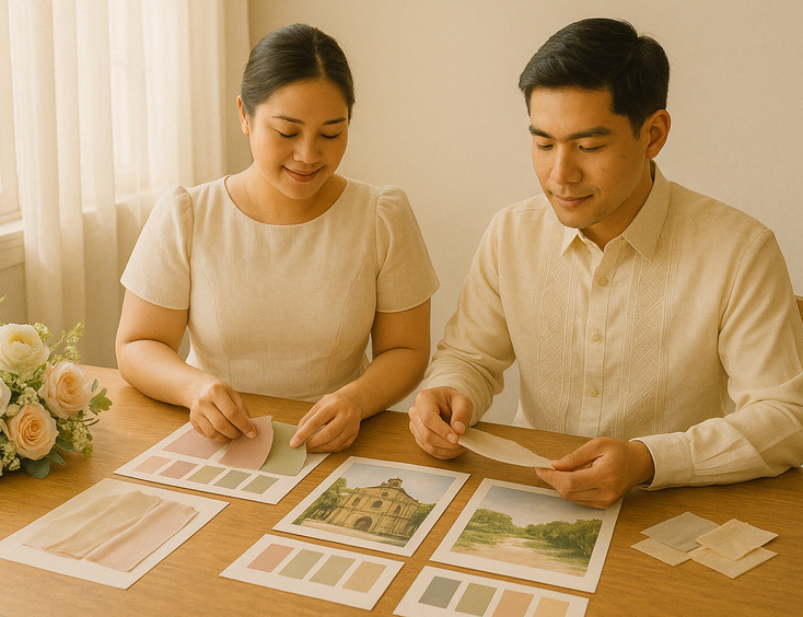
Color workflow that keeps costs calm
Create a small palette two mains one accent and a metal. Order tiny fabric and ribbon swatches and compare them in daylight and evening light. Share the board with your styling and flower teams early so substitutions stay within range. Begin shortlisting partners via stylists who shape spaces and blooms and bring your swatch set to every consult.

Stationery sets the tone first
Your motif meets guests in the invitation suite. Echo the palette with subtle embossing capiz textures or woven patterns and keep typography clean. When you are ready to match paper and palette browse makers of invitations and print suites and request paper stocks that hold color in humid venues.
Color meets fabric
Heat changes how color reads and how fabrics move. Chiffon georgette and organza take dye softly while crepe holds richer tones with smooth drape. For pairings that stay comfortable in the tropics keep this guide to fabric choices that breathe close as you finalize swatches.
Dress the entourage with cohesion
Choose one fabric family then mix necklines or sleeve shapes for comfort. Mothers can wear a deeper shade of the motif for distinction in portraits. For practical styling across generations save these ideas for coordinating the bridal party with Filipino flair.

Metals jewelry and finishing touches
Gold warms coral and champagne while silver freshens sage and sky. Pearls and subtle filigree echo heirloom themes without stealing focus from the gown. When it is time to finalize adornments consider accessories that match your palette so earrings pins and combs align with your chosen metal.
Photo ready palette checks
Ask your photographer to test a bouquet against your gown and venue wall in natural light. Adjust the accent color slightly lighter or deeper so it does not merge with the background. Keep emergency swaps ribbon spools spare boutonnieres and a neutral shawl ready for last minute tweaks.
Pulling it together
If you want one map that ties fabrics etiquette timelines and spending into a calm sequence continue with the complete wedding dress roadmap for Filipino brides. With a small focused palette and motifs that honor home your wedding day will look timeless in every venue from nave to shoreline.
Still Searching for a Right Match?
Find Your Perfect Wedding Supplier Today!
Discover trusted wedding suppliers across the Philippines in our complete directory. Compare services and connect with the ones that fit your dream celebration.
Browse Wedding SuppliersFeatured Posts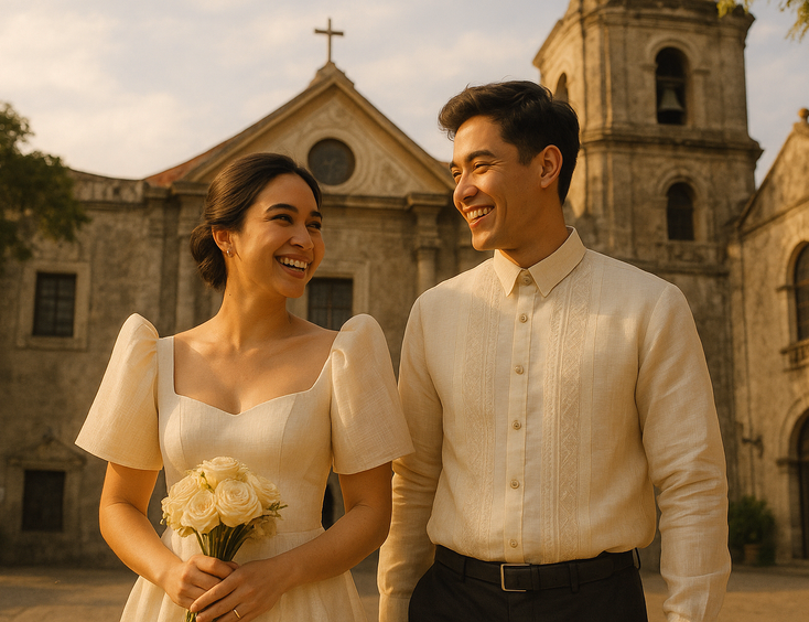


Filipino Wedding Dress Guide for Style Traditions and Smart Shopping
6 mins readFilipino Wedding Cost Guide - Realistic Budgets, Percentages, and Price Drivers by Region
9 mins readPhilippines Honeymoon Guide - Best Islands, Resorts, Costs & 7–14 Day Itineraries
9 mins readFilipino Wedding Games - Traditions, Modern Twists, and Crowd-Pleasers for Every Reception
8 mins read